


Written by Rick Kubina
In 1981, an important paper appeared in The Behavior Analyst titled Current measurement in applied behavior analysis. The paper reviewed the practice of using discontinuous time-based measures to count and record behavior.
Interval recording represents a prime example of a discontinuous time-based method for behavioral observation. Let’s take the example of “momentary time sampling” or MTS. To use MTS, an observer looks to see if the behavior occurs during a specified moment or a pre-selected interval of time (Cooper, Heron & Heward, 2007). Thus the name, momentary time sample.
Let’s practice MTS. To try it for yourself, CLICK HERE to open an interactive recording sheet in a new window.
Next, start the video clip (below). You will see a timer at the bottom of the clip. Every six seconds make a check if our friend the blue circle appears in the center of the screen.
At the end of each 6-second interval, see if the observation target occurs. The target to observe: the appearance of a blue circle in the middle of the screen. Moving in the screen or leaving the screen does not count as the target observation. Anytime during the 1 second moment (i.e., 6, 12, 18, 24, 30, 36, 42, 48, 54), if you see the ball resting in the middle of the screen give it a checkmark for a count of one.
Figure 1. A video of a blue circle appearing across time.
What count did you end up with? Did you note more of the blue circles appeared than the momentary time sampling allowed you to count?
Some people choose to use interval recording methods like MTS to count behavior. Making the decision to measure only a sample of the full range of behavior creates an artificial ceiling. In Precision Teaching, we call all practices where we have an upper limit on what we can record a “record ceiling.”
In the previous exercise, we can easily see the record ceiling. If you used the pdf form above, you can make out the number of times possible to count and record the target observation. The animated gif below shows we can only record a maximum of nine counts.
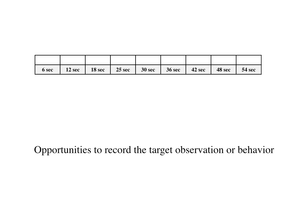
Figure 2. An animated gif showing the possible number of observations.
Therefore, the term “record ceiling” functionally defines its use. When making a record (of an observation), we encounter a ceiling (a limitation). Thus, on the Standard Celeration Chart, the record ceiling tells chart readers a ceiling occurred for measuring a specific data point.
If you go back to Figure 1 and count the frequency of the blue circle appearing, what do you come up with? The MTS and frequency count portray a stark difference in the frequency of recorded target observations. The MTS yielded a count of 2 appearances of the blue circle compared to 12 for the 59 second counting time.
On the Chart, we can now see the two frequencies and the destination of the record ceiling. The record ceiling draws our attention to something different about the observation.
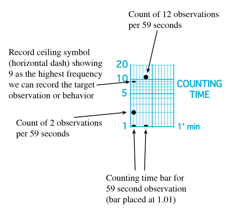
Figure 3. A cross-section of the Standard Celeration Chart showing two different observations of the same target.
By displaying the record ceiling, chart readers have additional information guiding their analysis. The data can only go as high as the record ceiling.
The record ceiling can come from other places aside from discontinuous time measures. Using percent correct, for example, also imposes a record ceiling. Let’s say we give a spelling test and have 10 items. Choosing percent correct imposes a ceiling of 100% (10 correct and zero incorrect).
Record ceilings, like the time bar, give the chart reader more information. And any extra details help the performer and clinical/educational team fully analyze the data and facilitate decision making.