Written by Rick Kubina
Recently, I wrote about three features the world needs when understanding behavior change: celeration, bounce (variability), and outliers. We now turn our attention to bounce.
Variability refers to measured behavior which occurs at different frequencies across time. Precision Teachers used the term “bounce” because the performance frequencies bounce around on the chart.
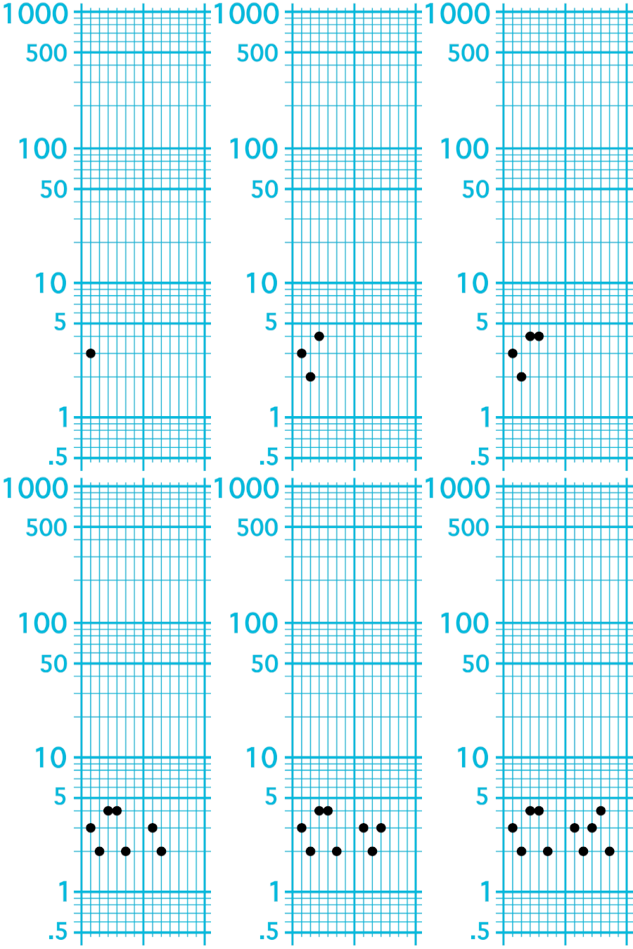
What varies and bounces around? Aside from me on the dance floor, think about any behavior we might measure. Say a student raising her hand in class. One day we might observe a frequency of 3 hand raises. The next day 2, the following day 4, and then 4 and 2 on the last two weekdays. So we have the following observed frequencies:
Monday 3
Tuesday 2
Wednesday 4
Thursday 4
Friday 2
The next week we measure the behavior for 5 more days and measure the following:
Monday 3
Tuesday 2
Wednesday 3
Thursday 4
Friday 2
Look at the frequencies in the animated gif and watching those frequencies bounce around like no one’s business!

Figure 1. Animated gif showing performance frequencies bounce around the chart. Variability (or bounce) reflects the changes that occur from performance to performance.
Why doesn’t the student always raise her hand 3 times a day when we measure the behavior? Because human behavior varies. And it varies for all sorts of reasons. The causes can reside within the instructional environment. Perhaps the teacher ignores our student more one day than the next?
Other reasons for variability occur within the student. The student may feel sick which affects the likelihood of her raising her hand. Or the questions asked by the teacher may have uneven difficulty so some days our student knows the answer while other days she does not. We could go on. But whenever we measure behavior across time we will see certain properties: celeration, or the speed of change; and bounce, the variability or consistency with which the behavior occurs.
How does bounce help us understand the pinpointed behavior?
Bounce shows how much control exists in the measured data. From a classic book on behavioral research, Parsonson and Baer (1978) wrote: “A highly variable baseline…suggests that potentially controlling variables occasionally were in effect” (p. 120). In other words, the larger the spread of data, or the more bounce we see, the less control we have.
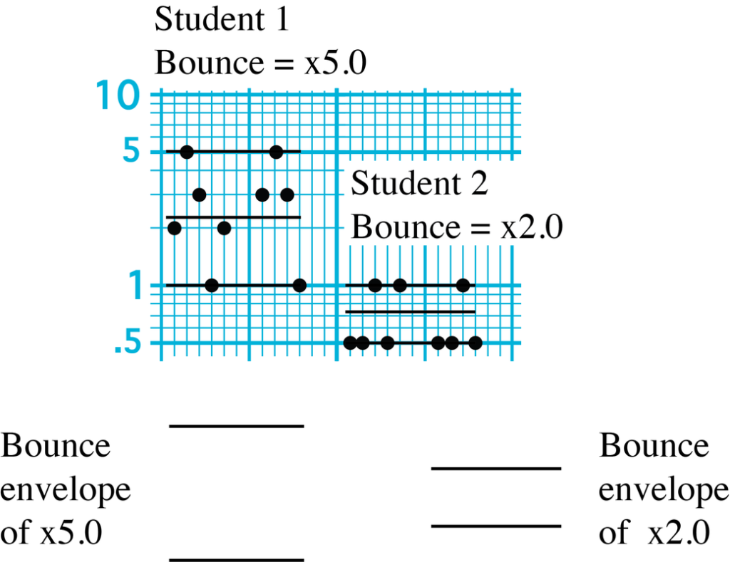
Take a look at the two different data sets. The first data set shows the frequency of a student leaving his seat during class for one week. The second set of data shows another student’s frequency of leaving his seat. With the greater bounce we can see that we have much less control in the instructional environment for student 1 than student 2.

Figure 2. A cross section of the SCC (Standard Celeration Chart) comparing the frequencies of two students leaving their seats during class.
By control, I don’t necessarily mean teacher power. In science, when we use the word “control,” we mean influence. A teacher can arrange a classroom so the influence of what students do occurs due to different environmental variables. For example, a sign posting the classroom rules can influence student behavior as much as a teacher speaking directly to the student.
Why use the SCC for bounce?
Figure 2 shows us bounce. Not only can we see bounce but we can quantify it. For example, the first student has a bounce value of x5.0. The bounce value states that within the envelope the data will vary from smallest to highest by a ratio of x5. A x5 bounce indicates a moderate degree of variability.
The second student has a smaller bounce envelope of x2.0. A x2.0 bounce value suggests strong control. Looking at the SCC we can see that each day student 2 leaves his seat between 0 and 1 times. The consistency or regularity in the tight bounce envelope communicates performance frequencies varying very little. We know exactly how much they vary by the bounce value of x2.0.
We can compare values and see the degree of difference between performers. A x5.0 bounce value is x2.5 great than x2.0. Those values tell the teacher-student 1 has more than double (almost 3 times) the variability than student 2.
If someone asked you why we should use an SCC for bounce or variability instead of a nonstandard linear graph (NSLG), tell them we have three very substantial reasons.
- Behavior lives in the multiply world. Behavior will maintain the same multiple whether it accelerates or decelerates (Lindsley, 2010). With a NSLG all bets are off. The variability or bounce envelop will change depending on which way the behavior changes.
- Bounce has a numerical value. With numbers, we can qualify change and therefore better understand what is happening. We want numbers; we don’t want to rely on less precise methods like using words (e.g., small variability, moderate variability, large variability).
- A standard chart means once we come to recognize bounce, we can quickly ascertain the degree of control we have just by looking at the SCC. Bounce is a visual and quantitative indicator of control. Let’s always forge our analyses in the rich metrics of the Standard Celeration Chart.
Bounce is a visual and quantitative indicator of control. Let’s always forge our analyses in the rich metrics of the Standard Celeration Chart.
References
Lindsley, O. R. (2010). Skinner on measurement. Kansas City, KS: Behavior Research Company.
Parsonson, B., & Baer, D. (1978). The analysis and presentation of graphic data. In T. Kratochwill (Ed.), Single subject research (pp. 101–166). New York, NY: Academic Press.


